Nominerade 2023: Graphic design
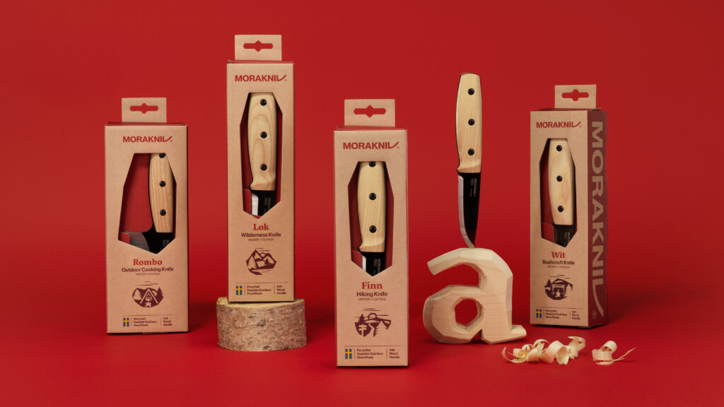
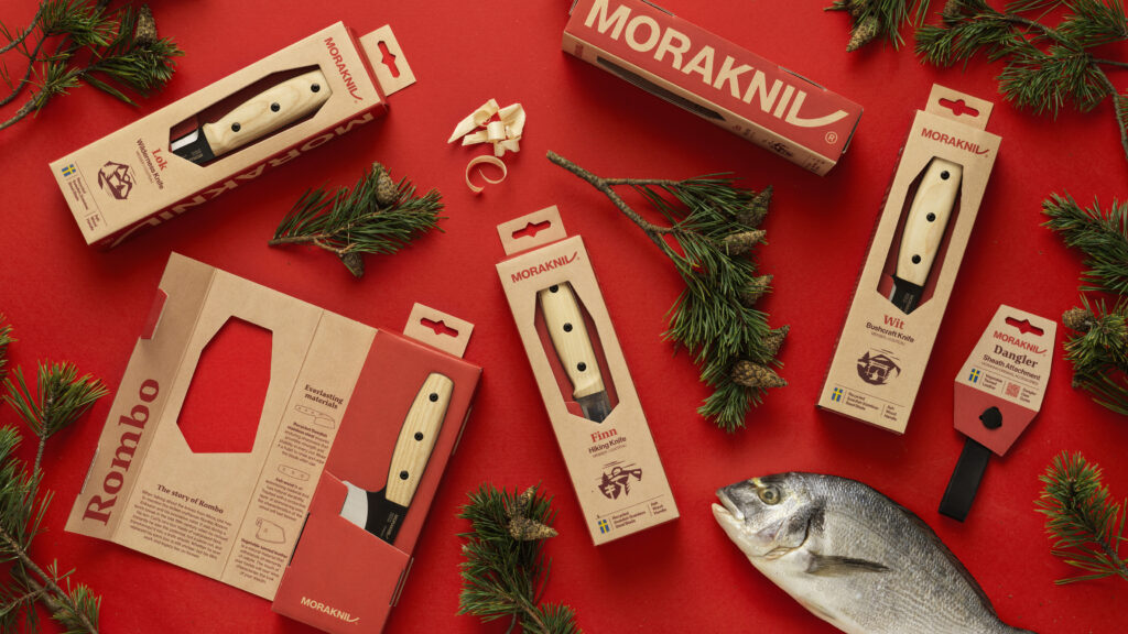
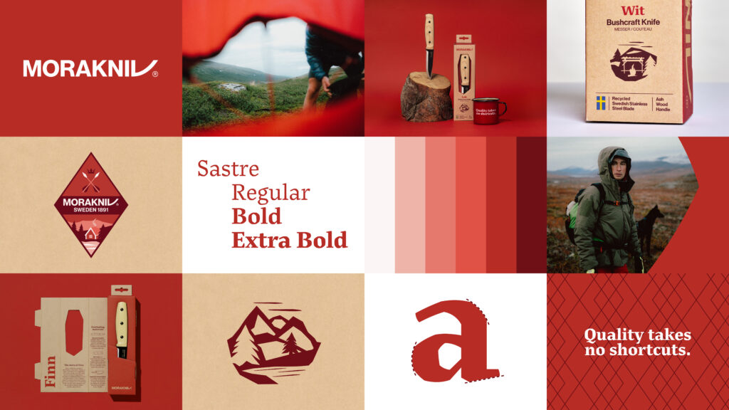
Morakniv’s new recyclable packaging
(Identity Works)
Morakniv’s recyclable packaging celebrates a 130-year-old history of knife craftsmanship. The packaging is made from a single piece of cardboard and holds the knives securely in place without any plastic. Concurrently, a new graphic design profile was also developed for Morakniv, with a lovingly crafted type font reflecting the storied heritage of the brand.
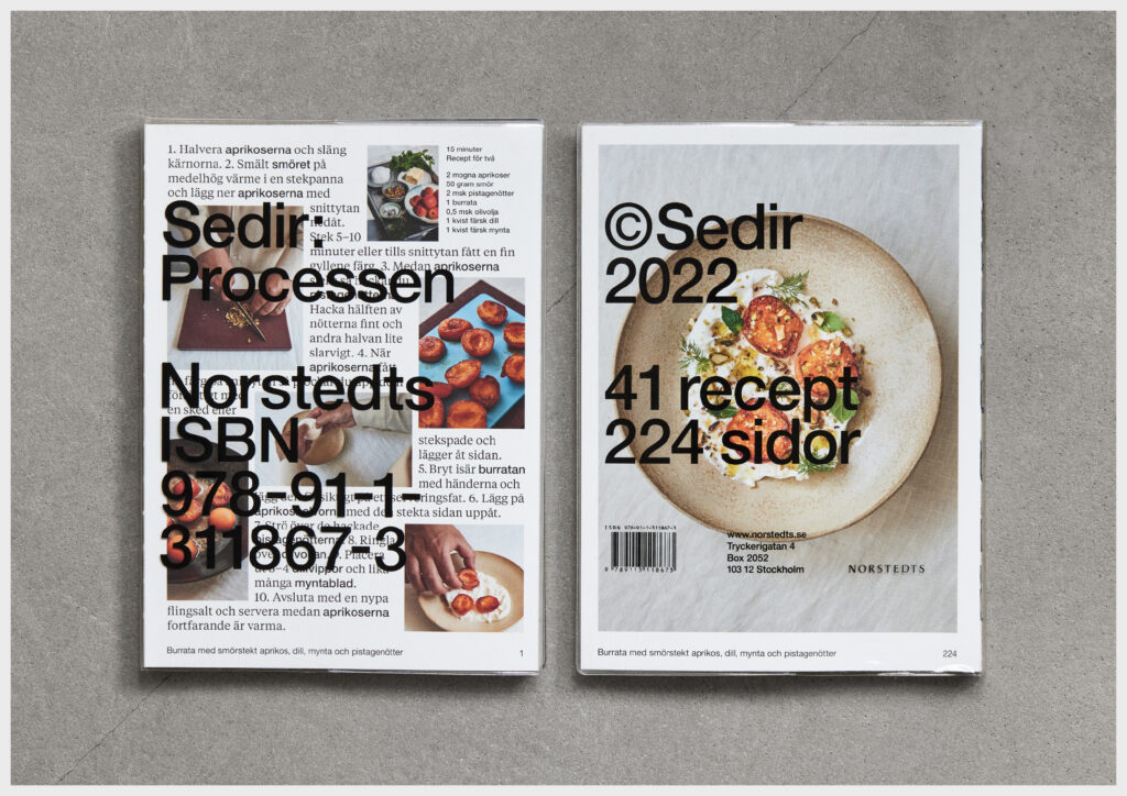
Sedir: Processen
(Open Studio)
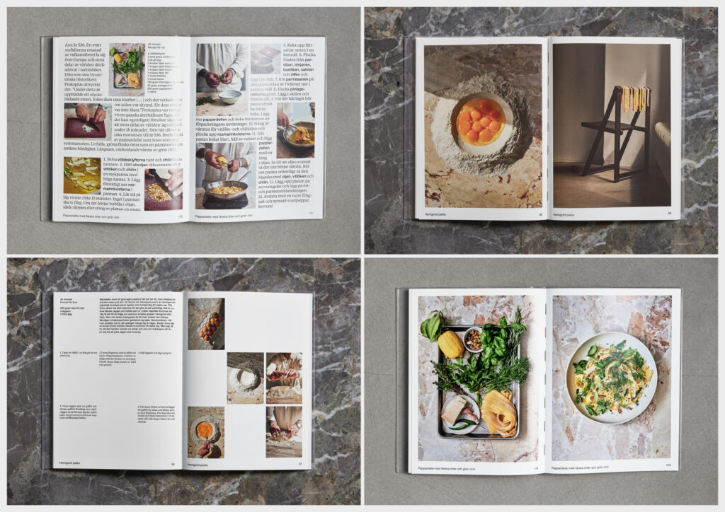
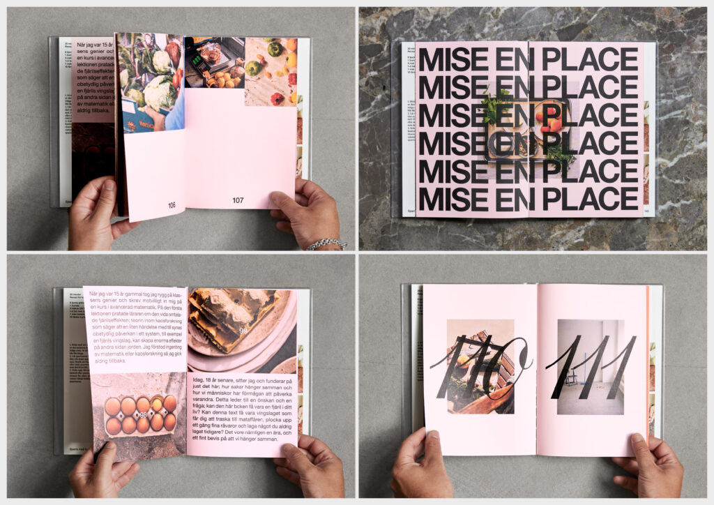
Sedir cooks on Instagram. In a clear and easy-to-follow process, he shares both recipes and food philosophy. Through a cookbook, a grocery store (which sells the items needed to cook the recipes in the book) and a restaurant (which serves the recipes), his cooking stepped out of the internet and all the way to the taste buds of his followers.
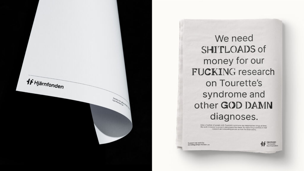
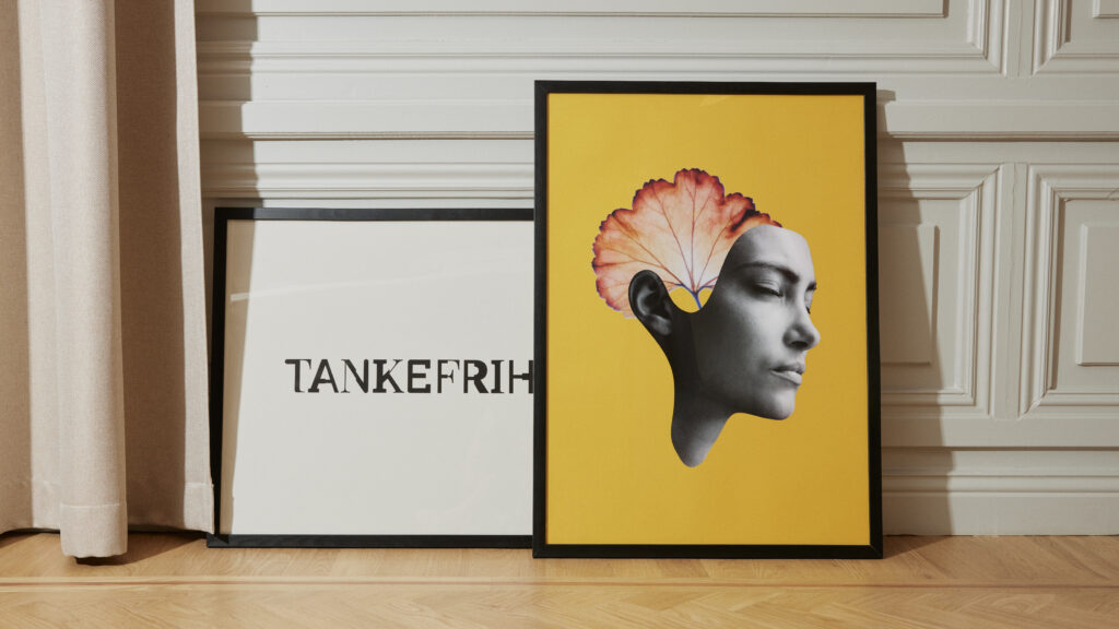
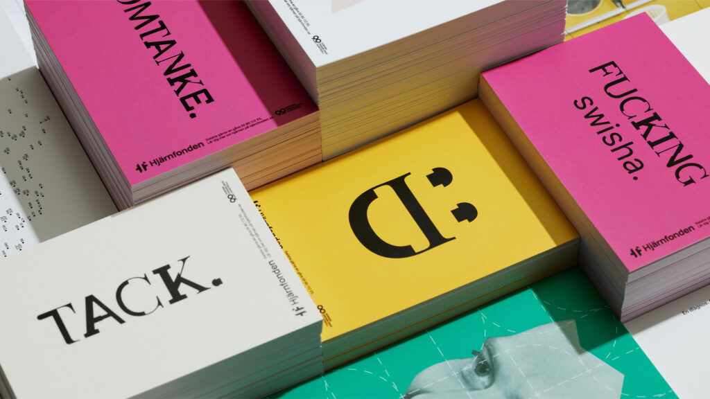
Tänk om. Tänk på Hjärnan.
(Nord DDB)
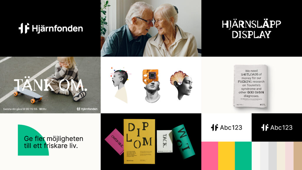
The new brand identity of Hjärnfonden (The Swedish Brain Foundation) has two sides – the rational, structured, distinct and comprehensible; and the surprising, irrational and unexpected. The rational rests on a solid foundation of the new logotype with an acronym, a strict and clear typeface, and a clean black and white base. On that foundation, a layer of boundless creativity is, like our elastic brain, expressive and adaptable to the purpose of the communication.
