This year’s visual identity
The design agency Amore Brand Identity Studios is behind this year’s identity for Design S. Creatives Anders Jandér and Andreas Doré have worked with the project and here they describe the ins and outs of their process.
What is your fundamental idea based on?
We wanted to provide a glimpse into the hidden world of objects or projects of which the public usually only see the end result. The basic idea is to highlight the many layers of work and choices behind the finished expressions that are competing in Design S.
You based your work on a well-established “S” logo that follows Design S every year.
How did you work to deepen that logo in its expression?
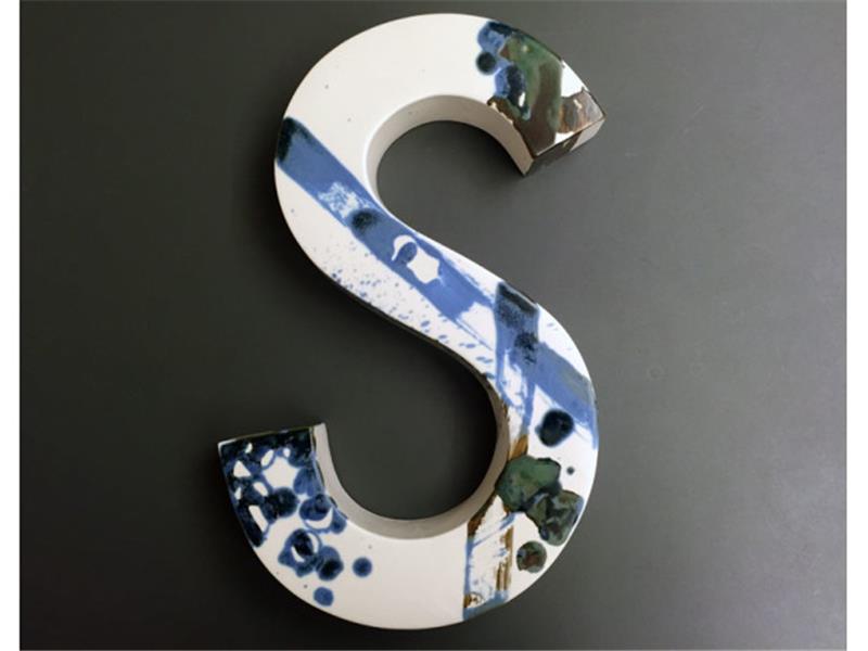
In the theme we chose, there was room to build on the competition’s current logo and add more features. We chose to further develop it to a physical object, a tool – something that creates design, and at the same time bears identity in itself.
There is a generous image identity tied in with the graphic identity, how have you worked with the image material?
We wanted to open up for the competitors’ own thoughts about design in a visual form by letting them share their sketches and inspirational images. In order to both complement and contrast the competing projects, we also contributed with our own research and inspirational images, from this and previous jobs. We also personally made some images with and around the S logo to clarify the bridge between design and various places that we think have meaning and connection to design and inspiration.
You seem to work very inclusively, what signifi- cance does that have for your own expression?
Cooperation is built in to the basic idea of the concept and, together with the material we developed for the project, the competitors’ material will hopefully create a somewhat nuanced, colourful and inspiring picture of what design in Sweden can be today.
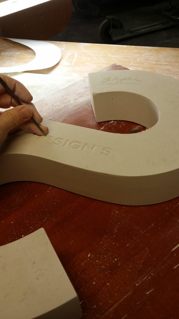
The awarded entries in this year’s competition receive a ceramic S designed by Amore Brand Identity Studios in collaboration with the Porcelain factory in Lidköping.
