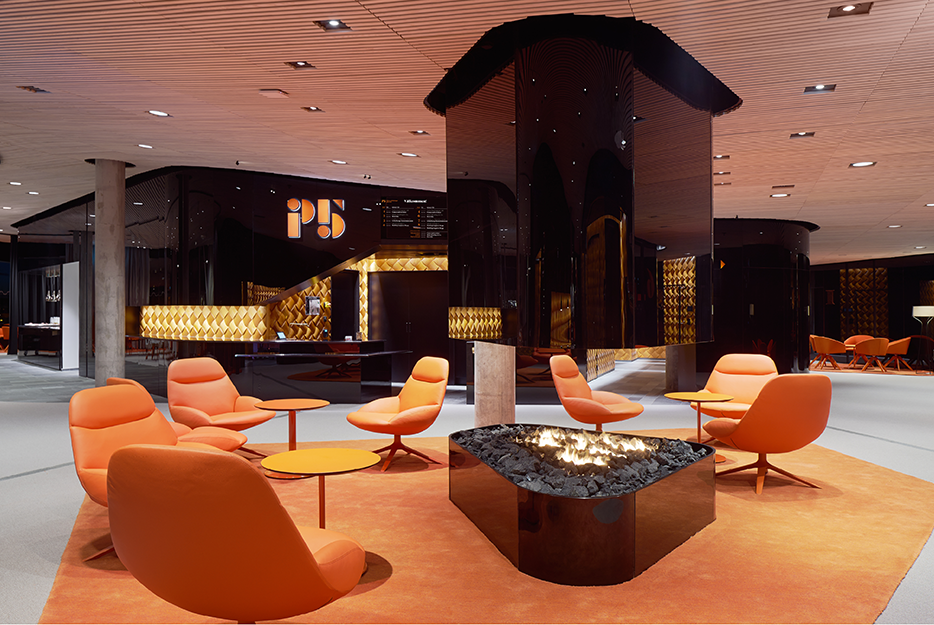
P5 is an educational, event and conference centre in Umeå whose visual identity and signage concept create a unique environment in direct harmony with its conceptual architecture. All components of the visual identity and accompanying sign concept are rooted in the brand platform and its essence “Smarter meetings”, as well as being in total harmony with the architecture – all to create good conditions for successful meetings and a strong experience of the brand and the place.
P5 aims to provide the best opportunities for an efficient meeting – the visual identity and navigation plays a central part in this. The signage concept has a clearly hierarchical and logical structure where the visitor easily (and subliminally) deciphers the sign system for efficient and smooth navigation. In the public flows of the complex spatiality is a logical number of strategic points through which visitors are effortlessly guided to their final destination. As a visitor, you are met with a clear, transparent and coherent whole in a unique environment where all components work for a smarter meeting.
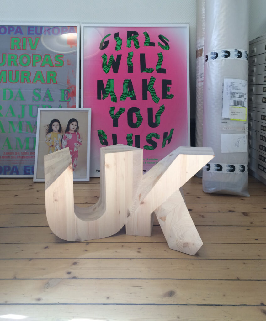
Unga Klara is a world leader in norm creative theatre serving children and youths. In our work with the visual identity, we created a manifesto that reflects the business and that can be added to as needed. With the manifesto as a starting point, we have used norm creative methods throughout. For example, we have explored a separatist approach in the choice of subcontractors.
The typeface is at the heart of the visual expression. To go with the basic typeface, we created 7×3 special characters that “clash” with the typeface. The characters were designed from scratch and show a perspective approach. One character for every letter in Unga Klara’s name – UNGAKLR. These special characters replace the letters in all headings in Unga Klara’s external communication, symbolising a changing reality and illustrating that the theatre’s business is anything but static. We created one symbol and several “logos”. The symbol is available in animated gif, as well as in physical form.
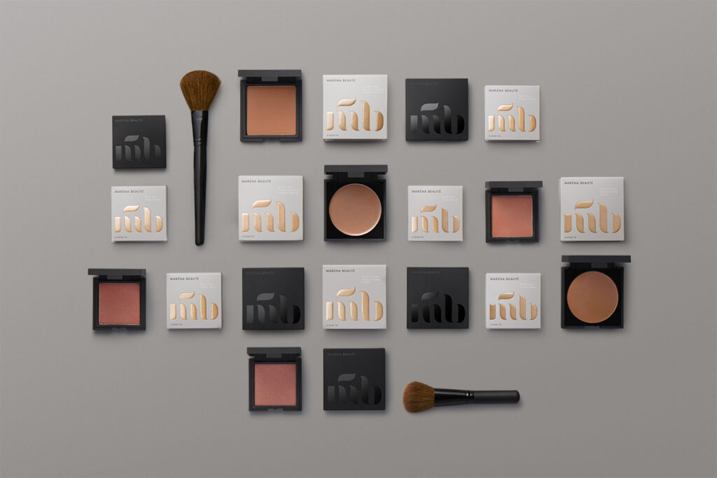
Maréna Beauté is a new Swedish cosmetics brand offering high quality products to people with dark skin types. The brand was founded in 2013 by makeup artist Diarry Maréna, who is originally from Senegal. The most important element in the visual identity is a monogram inspired by the soft strokes from a make up brush. The monogram is flexible and can be used in various ways as a recurring graphic element throughout the identity. The calm, earthy colour palette leaves room for future product development in new colour schemes, and the copper foil links back to the origin of the brand in a sophisticated and subtle way.
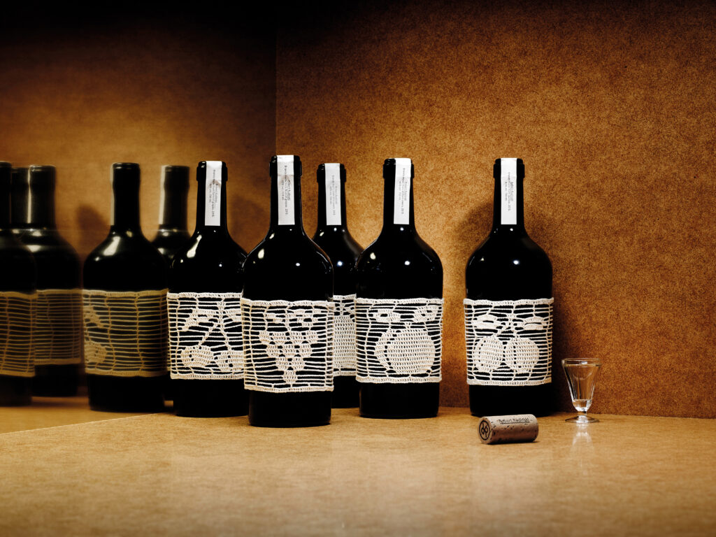
Crocheting and vodka are two very Eastern European crafts. By weaving them together, we have created a product that stands out in the bar environment and celebrates the origin of the brand. In the spring of 2015, Robert Rudinski launched a series of fruity vodkas in six flavours that were released in select bars in Stockholm. The fruit is picked by hand in the Hungarian village of Göncruszka and each label is hand crocheted by the village seamstresses. Under the white, letterpress seal hides a cork wrapped by the beverage’s creator Robert Rudinski. The edition is limited with an initial delivery of 1200 bottles.